
Reconstruct
Lightfoot Chiropractic

Quick refresh
I sought out information about Lightfoot Chiropractic after hearing glowing testimonials. After visiting the clinic, I felt that there was a disconnect between the online presence of the clinic and its modern, patient-centric approach.
I decided to create a mock-up for a new site design while learning how to use Webflow. Though the clinic did not opt to change their existing site (other than to have a few errors fixed), this pet project gave me the opportunity to learn my way around a new site-building platform and to think about balancing user and business needs.
Goals
Meet Accessibility Standards
Most chiropractic patients are aged 45-64; having a site that is easy to read is vital.
Guide Visitors
Content needs to be clear and concise, with direct call to action pathways.
Anticipate Questions
Providing information in digestible portions eliminates the need for a lengthy FAQ section.
Foster Connection
Including staff bios and photos helps patients begin establishing familiarity before their visit.
Express Brand Personality
An updated color palette and spacious layout reflect the clinic's modern, welcoming vibe.
Save Time Upfront
Providing guidance about the process allows staff to dedicate more time to in-office patients.
Accessibility and ease of use
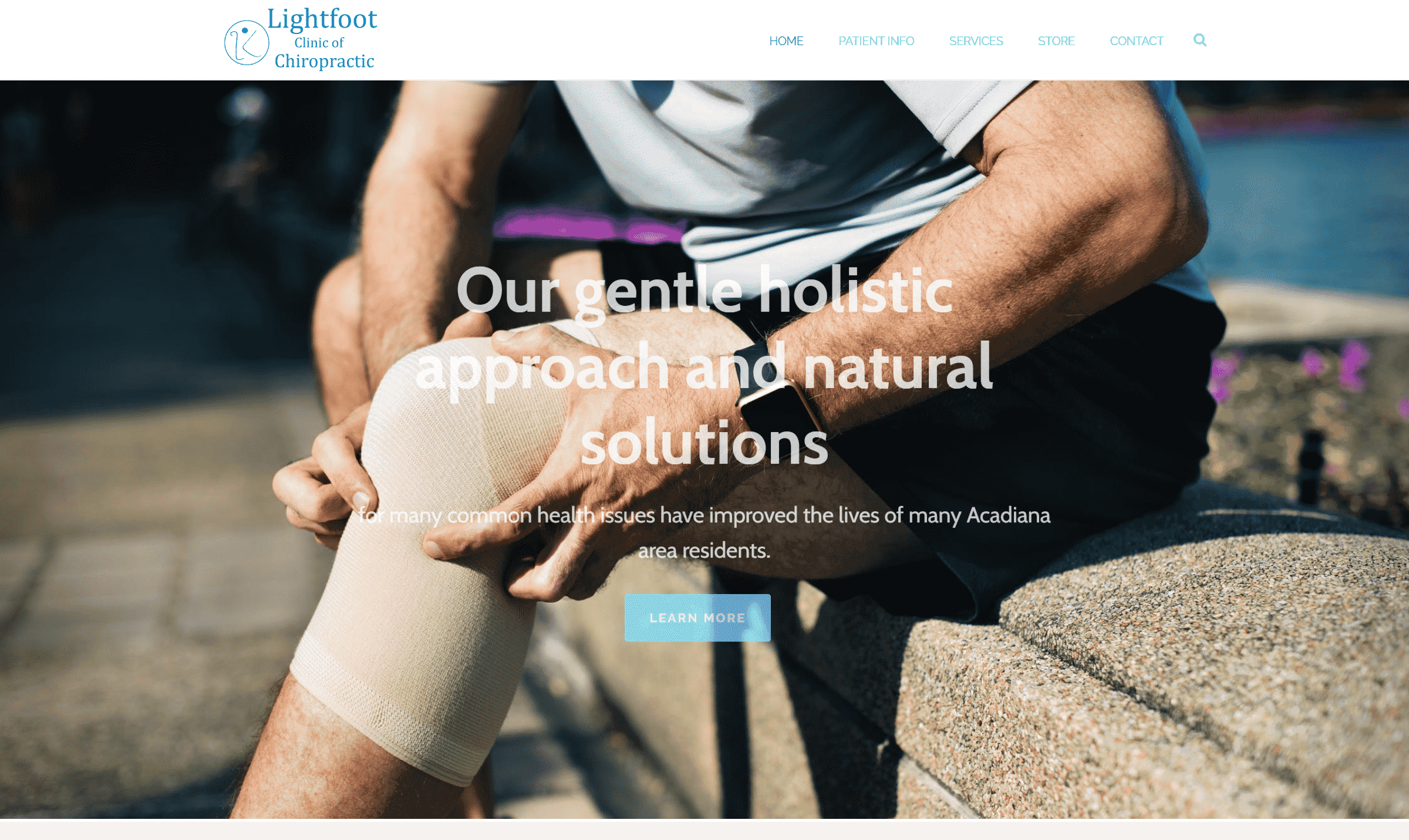
I avoided using automatically playing video clips, especially in background imagery, to increase readability and reduce the chances of triggering vertigo or headaches. Instead, I opted for static images and backgrounds with solid colors and minimal graphics.
Current Design
Proposed Design

Content was divided into sections separated by background color and graphic elements to enable site visitors to scan the page more easily. Text blocks were formatted with left alignment to increase readability.
Descriptions of processes and tools were condensed and re-worded to read in plain language. Tool descriptions were sectioned into tabs to reduce text blocks and cognitive load, and to add an interactive element to the site.
The amount of white space was greatly increased, reducing visual strain and overwhelm and creating feelings of cleanliness and spaciousness. The colors featured in the top nav bar and footer were changed to create higher contrast.
Current Design
Proposed Design


Anticipating patient needs
A brighter secondary brand color was added to make CTA buttons easier to find. The brighter color was used sparingly so that it would remain difficult to overlook.
Commonly asked questions were added on relevant site pages, eliminating the need for a FAQ section. An overview of a general patient journey was created, helping patients prepare and reducing the amount of time that care coordinators would need to spend relaying basic information to potential patients.
I've found that many users can feel as though communications sent via an embedded contact form can go unanswered, so the direct email address is also provided, encouraging hesitant visitors to reach out in a way that is most convenient and comfortable for them.
Content throughout the site reassures the patient that their plan of care will be tailored to meet their needs, and that their well-being is the clinic's top priority.


Building trust and connection
Extra space was added so that all staff members could be featured on the website, allowing patients to become familiar and more comfortable with the staff before their first visit. Including more details about what to expect can help put neurodivergent and shy patients at ease when entering a new situation.
Bio cards provide a quick introduction to team members, letting visitors choose how much information they'd like to be presented with.
Testimonial cards were added to the home page (pictured in the section above), highlighting stellar reviews and continuing to build on the trust that the clinic has been cultivating over the years.
Current Design
Proposed Design


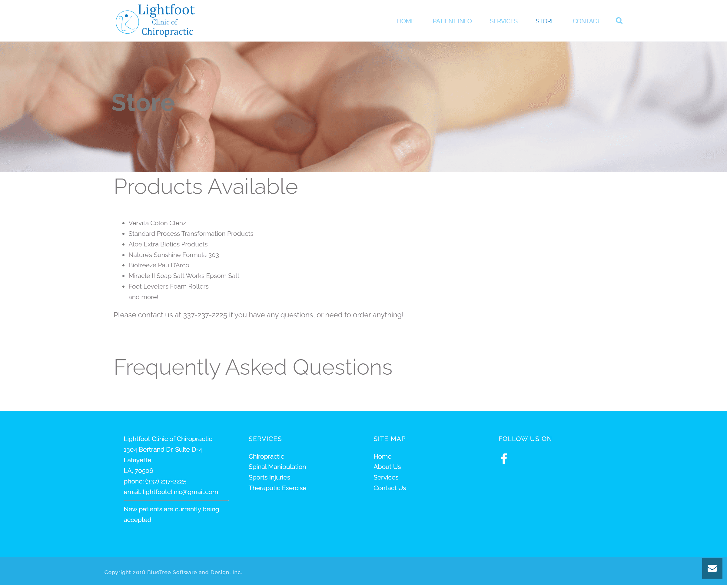
The 'Store' page was renamed 'Products' for clarity, as there is not currently an option to make purchases online.
The products page had imagery added to make it more interesting and appealing, and each card would ideally be linked to a more detailed list of products within each category. Having up-to-date information on the website would help create a more predictable and seamless patient experience.
The Frequently Asked Questions text in the current design is not responsive, and was not anticipated to be needed, so it was removed.
Current Design
Proposed Design

Project takeaways and next steps
One of my reasons for working on this project was to get familiar with Webflow and determine if it could be used for handing off projects to clients more efficiently than Framer. I did enjoy learning Webflow and I feel that it's ability to customize and more easily hand off projects would benefit freelance clients.
I've submitted this project for review in the Wired to Design community, and look forward to learning how other designers would have approached this project.
Get in touch
To learn more about this project or discuss anything design related, schedule a chat with me!
You can view more of my work by selecting the 'Next Project' button below, or returning to the Work page.
Lightfoot Chiropractic
Quick refresh
I sought out information about Lightfoot Chiropractic after hearing glowing testimonials. After visiting the clinic, I felt that there was a disconnect between the online presence of the clinic and its modern, patient-centric approach.
I decided to create a mock-up for a new site design while learning how to use Webflow. Though the clinic did not opt to change their existing site (other than to have a few errors fixed), this pet project gave me the opportunity to learn my way around a new site-building platform and to think about balancing user and business needs.
Goals
Meet Accessibility Standards
Most chiropractic patients are aged 45-64; having a site that is easy to read is vital.
Guide Visitors
Content needs to be clear and concise, with direct call to action pathways.
Anticipate Questions
Providing information in digestible portions eliminates the need for a lengthy FAQ section.
Foster Connection
Including staff bios and photos helps patients begin establishing familiarity before their visit.
Express Brand Personality
An updated color palette and spacious layout reflect the clinic's modern, welcoming vibe.
Save Time Upfront
Providing guidance about the process allows staff to dedicate more time to in-office patients.
Accessibility and ease of use
I avoided using automatically playing video clips, especially in background imagery, to increase readability and reduce the chances of triggering vertigo or headaches. Instead, I opted for static images and backgrounds with solid colors and minimal graphics.
Current Design
Proposed Design
Content was divided into sections separated by background color and graphic elements to enable site visitors to scan the page more easily. Text blocks were formatted with left alignment to increase readability.
Descriptions of processes and tools were condensed and re-worded to read in plain language. Tool descriptions were sectioned into tabs to reduce text blocks and cognitive load, and to add an interactive element to the site.
The amount of white space was greatly increased, reducing visual strain and overwhelm and creating feelings of cleanliness and spaciousness. The colors featured in the top nav bar and footer were changed to create higher contrast.
Current Design
Proposed Design
Anticipating patient needs
A brighter secondary brand color was added to make CTA buttons easier to find. The brighter color was used sparingly so that it would remain difficult to overlook.
Commonly asked questions were added on relevant site pages, eliminating the need for a FAQ section. An overview of a general patient journey was created, helping patients prepare and reducing the amount of time that care coordinators would need to spend relaying basic information to potential patients.
I've found that many users can feel as though communications sent via an embedded contact form can go unanswered, so the direct email address is also provided, encouraging hesitant visitors to reach out in a way that is most convenient and comfortable for them.
Content throughout the site reassures the patient that their plan of care will be tailored to meet their needs, and that their well-being is the clinic's top priority.
Building trust and connection
Extra space was added so that all staff members could be featured on the website, allowing patients to become familiar and more comfortable with the staff before their first visit. Including more details about what to expect can help put neurodivergent and shy patients at ease when entering a new situation.
Bio cards provide a quick introduction to team members, letting visitors choose how much information they'd like to be presented with.
Testimonial cards were added to the home page (pictured in the section above), highlighting stellar reviews and continuing to build on the trust that the clinic has been cultivating over the years.
Current Design
Proposed Design
The 'Store' page was renamed 'Products' for clarity, as there is not currently an option to make purchases online.
The products page had imagery added to make it more interesting and appealing, and each card would ideally be linked to a more detailed list of products within each category. Having up-to-date information on the website would help create a more predictable and seamless patient experience.
The Frequently Asked Questions text in the current design is not responsive, and was not anticipated to be needed, so it was removed.
Current Design
Proposed Design
Project takeaways and next steps
One of my reasons for working on this project was to get familiar with Webflow and determine if it could be used for handing off projects to clients more efficiently than Framer. I did enjoy learning Webflow and I feel that it's ability to customize and more easily hand off projects would benefit freelance clients.
I've submitted this project for review in the Wired to Design community, and look forward to learning how other designers would have approached this project.
Get in touch
To learn more about this project or discuss anything design related, schedule a chat with me!
You can view more of my work by selecting the 'Next Project' button below, or returning to the Work page.
Get in touch
To learn more about this project or discuss anything design related, schedule a chat with me!
You can view more of my work by selecting the 'Next Project' button below, or returning to the Work page.
Lightfoot Chiropractic
Quick refresh
I sought out information about Lightfoot Chiropractic after hearing glowing testimonials. After visiting the clinic, I felt that there was a disconnect between the online presence of the clinic and its modern, patient-centric approach.
I decided to create a mock-up for a new site design while learning how to use Webflow. Though the clinic did not opt to change their existing site (other than to have a few errors fixed), this pet project gave me the opportunity to learn my way around a new site-building platform and to think about balancing user and business needs.
Goals
Meet Accessibility Standards
Most chiropractic patients are aged 45-64; having a site that is easy to read is vital.
Guide Visitors
Content needs to be clear and concise, with direct call to action pathways.
Anticipate Questions
Providing information in digestible portions eliminates the need for a lengthy FAQ section.
Foster Connection
Including staff bios and photos helps patients begin establishing familiarity before their visit.
Express Brand Personality
An updated color palette and spacious layout reflect the clinic's modern, welcoming vibe.
Save Time Upfront
Providing guidance about the process allows staff to dedicate more time to in-office patients.
Accessibility and ease of use
I avoided using automatically playing video clips, especially in background imagery, to increase readability and reduce the chances of triggering vertigo or headaches. Instead, I opted for static images and backgrounds with solid colors and minimal graphics.
Current Design
Proposed Design
Content was divided into sections separated by background color and graphic elements to enable site visitors to scan the page more easily. Text blocks were formatted with left alignment to increase readability.
Descriptions of processes and tools were condensed and re-worded to read in plain language. Tool descriptions were sectioned into tabs to reduce text blocks and cognitive load, and to add an interactive element to the site.
The amount of white space was greatly increased, reducing visual strain and overwhelm and creating feelings of cleanliness and spaciousness. The colors featured in the top nav bar and footer were changed to create higher contrast.
Current Design
Proposed Design
Anticipating patient needs
A brighter secondary brand color was added to make CTA buttons easier to find. The brighter color was used sparingly so that it would remain difficult to overlook.
Commonly asked questions were added on relevant site pages, eliminating the need for a FAQ section. An overview of a general patient journey was created, helping patients prepare and reducing the amount of time that care coordinators would need to spend relaying basic information to potential patients.
I've found that many users can feel as though communications sent via an embedded contact form can go unanswered, so the direct email address is also provided, encouraging hesitant visitors to reach out in a way that is most convenient and comfortable for them.
Content throughout the site reassures the patient that their plan of care will be tailored to meet their needs, and that their well-being is the clinic's top priority.
Building trust and connection
Extra space was added so that all staff members could be featured on the website, allowing patients to become familiar and more comfortable with the staff before their first visit. Including more details about what to expect can help put neurodivergent and shy patients at ease when entering a new situation.
Bio cards provide a quick introduction to team members, letting visitors choose how much information they'd like to be presented with.
Testimonial cards were added to the home page (pictured in the section above), highlighting stellar reviews and continuing to build on the trust that the clinic has been cultivating over the years.
Current Design
Proposed Design
The 'Store' page was renamed 'Products' for clarity, as there is not currently an option to make purchases online.
The products page had imagery added to make it more interesting and appealing, and each card would ideally be linked to a more detailed list of products within each category. Having up-to-date information on the website would help create a more predictable and seamless patient experience.
The Frequently Asked Questions text in the current design is not responsive, and was not anticipated to be needed, so it was removed.
Current Design
Proposed Design
Project takeaways and next steps
One of my reasons for working on this project was to get familiar with Webflow and determine if it could be used for handing off projects to clients more efficiently than Framer. I did enjoy learning Webflow and I feel that it's ability to customize and more easily hand off projects would benefit freelance clients.
I've submitted this project for review in the Wired to Design community, and look forward to learning how other designers would have approached this project.
Back to Top
Get in touch
To learn more about this project or discuss anything design related, schedule a chat with me!
You can view more of my work by selecting the 'Next Project' button below, or returning to the Work page.
Get in touch
To learn more about this project or discuss anything design related, schedule a chat with me!
You can view more of my work by selecting the 'Next Project' button below, or returning to the Work page.